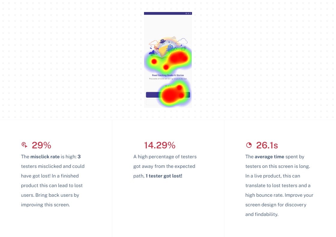
Kidemy


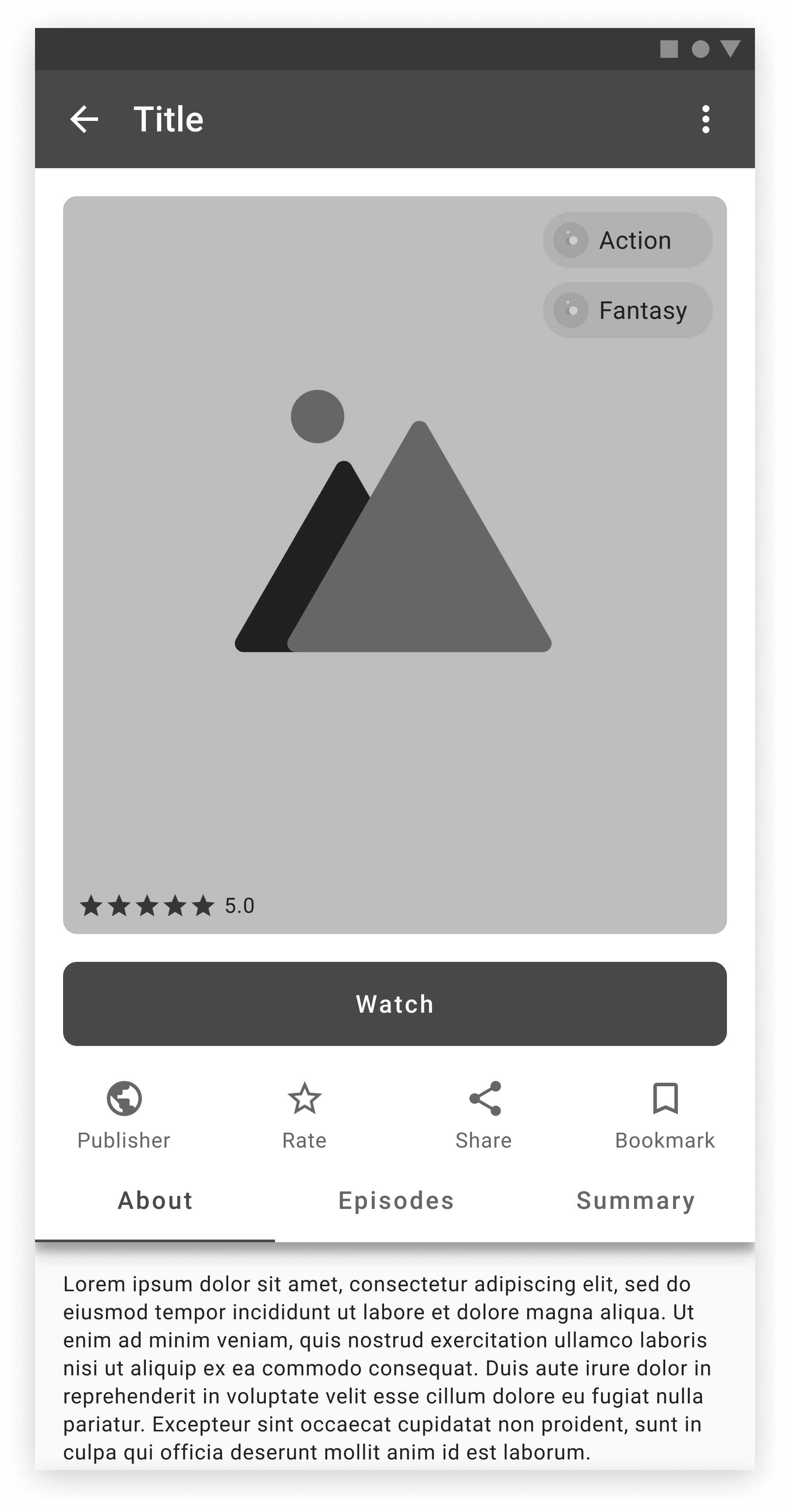
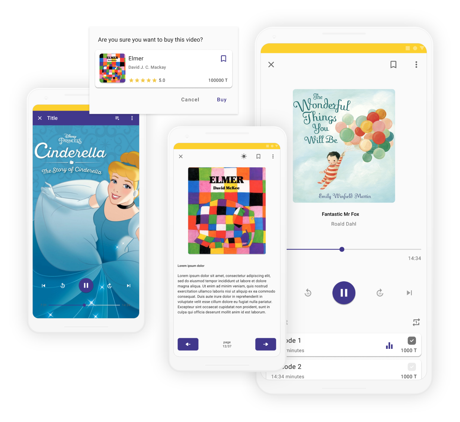
Video
Episode – Playing
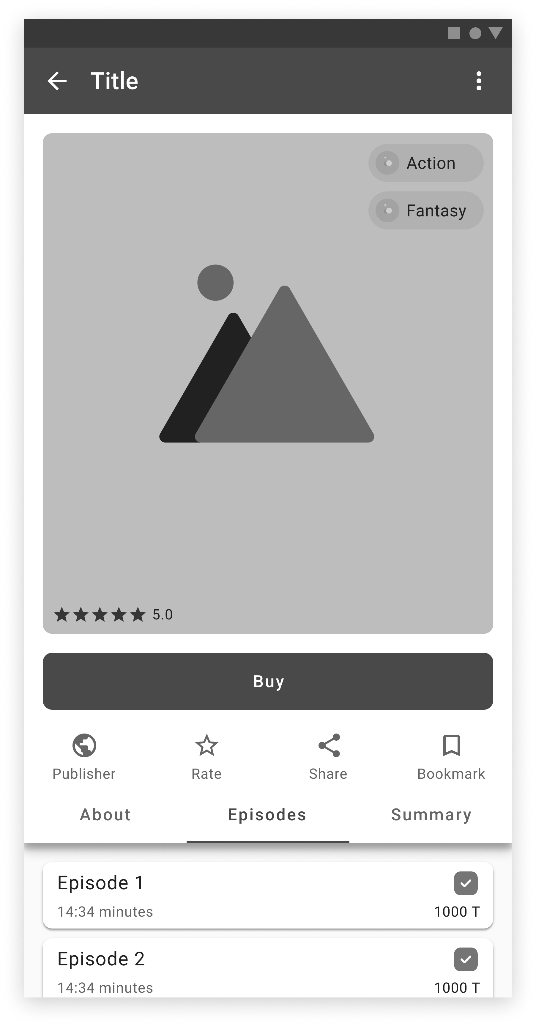
Episodes – Buy
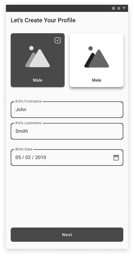
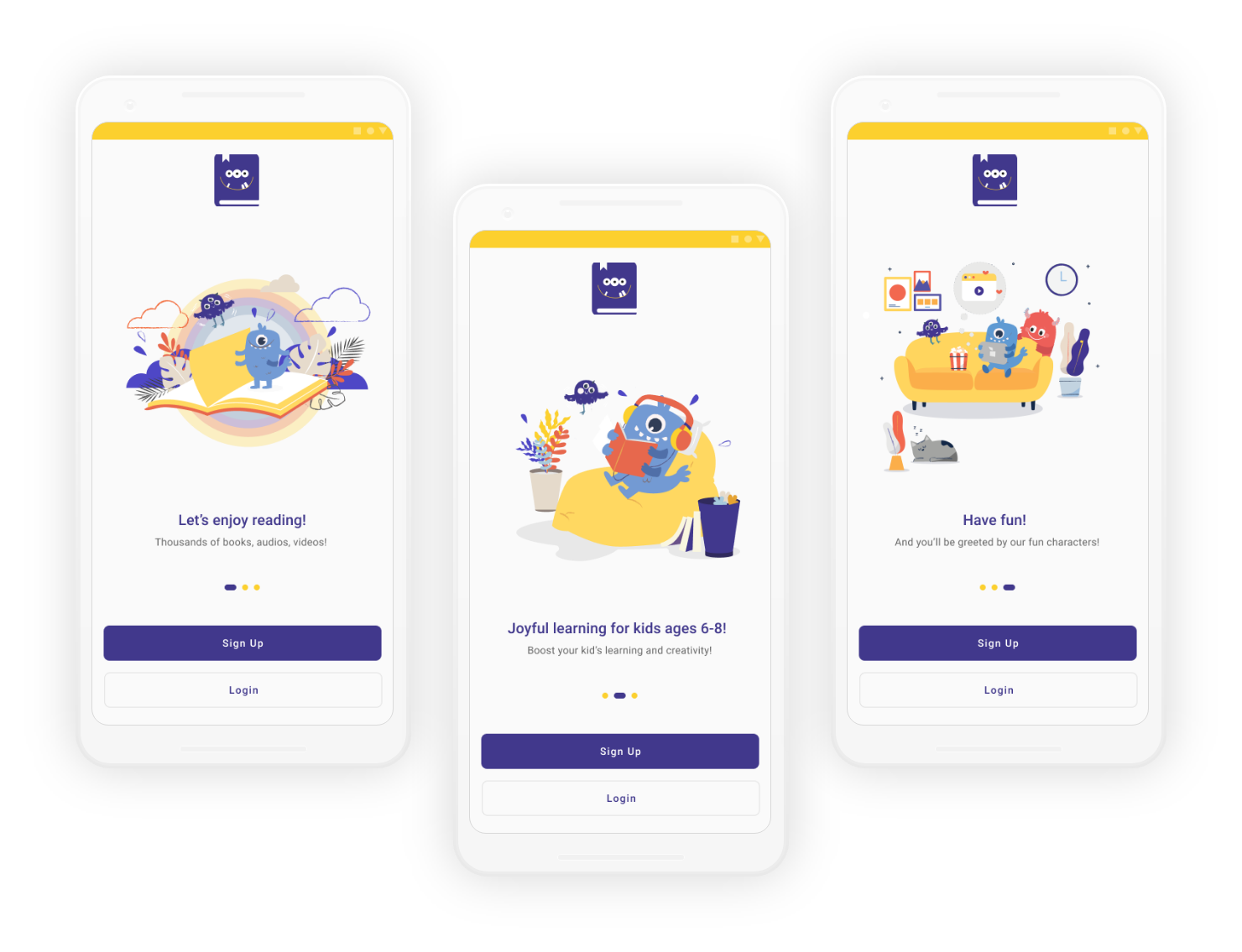
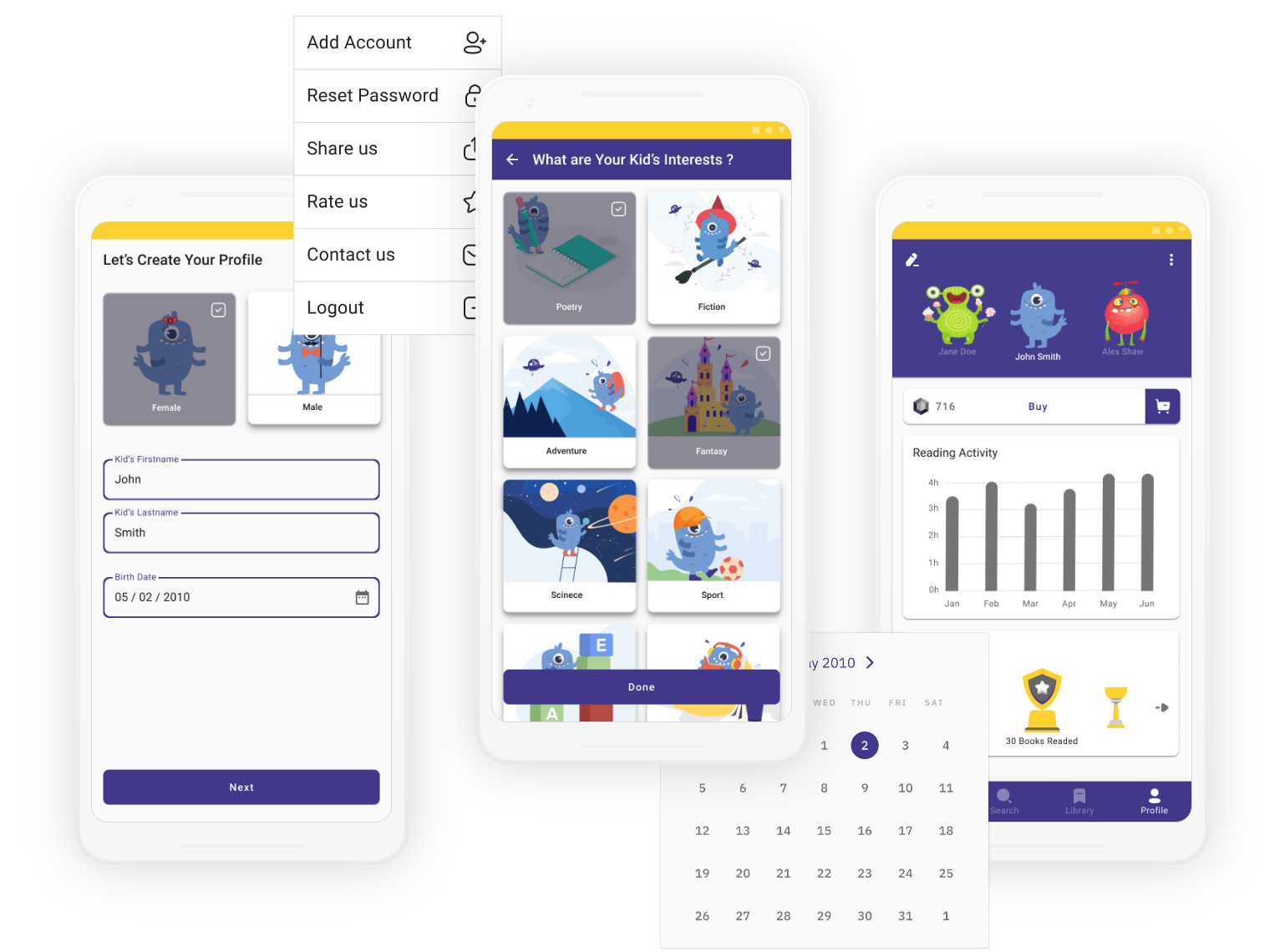
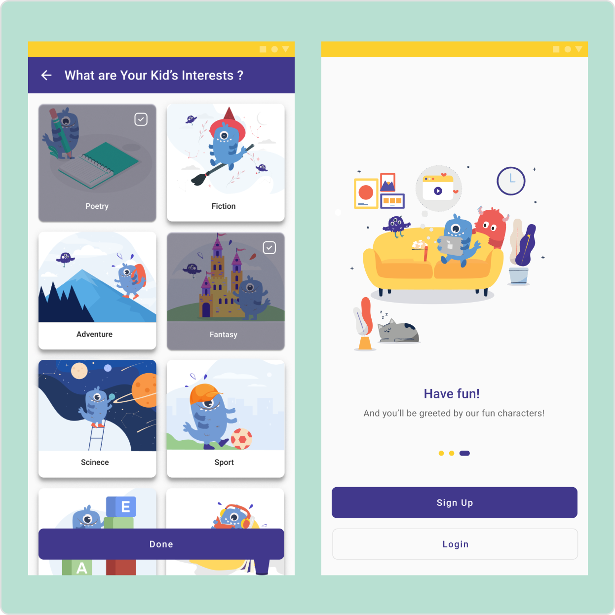
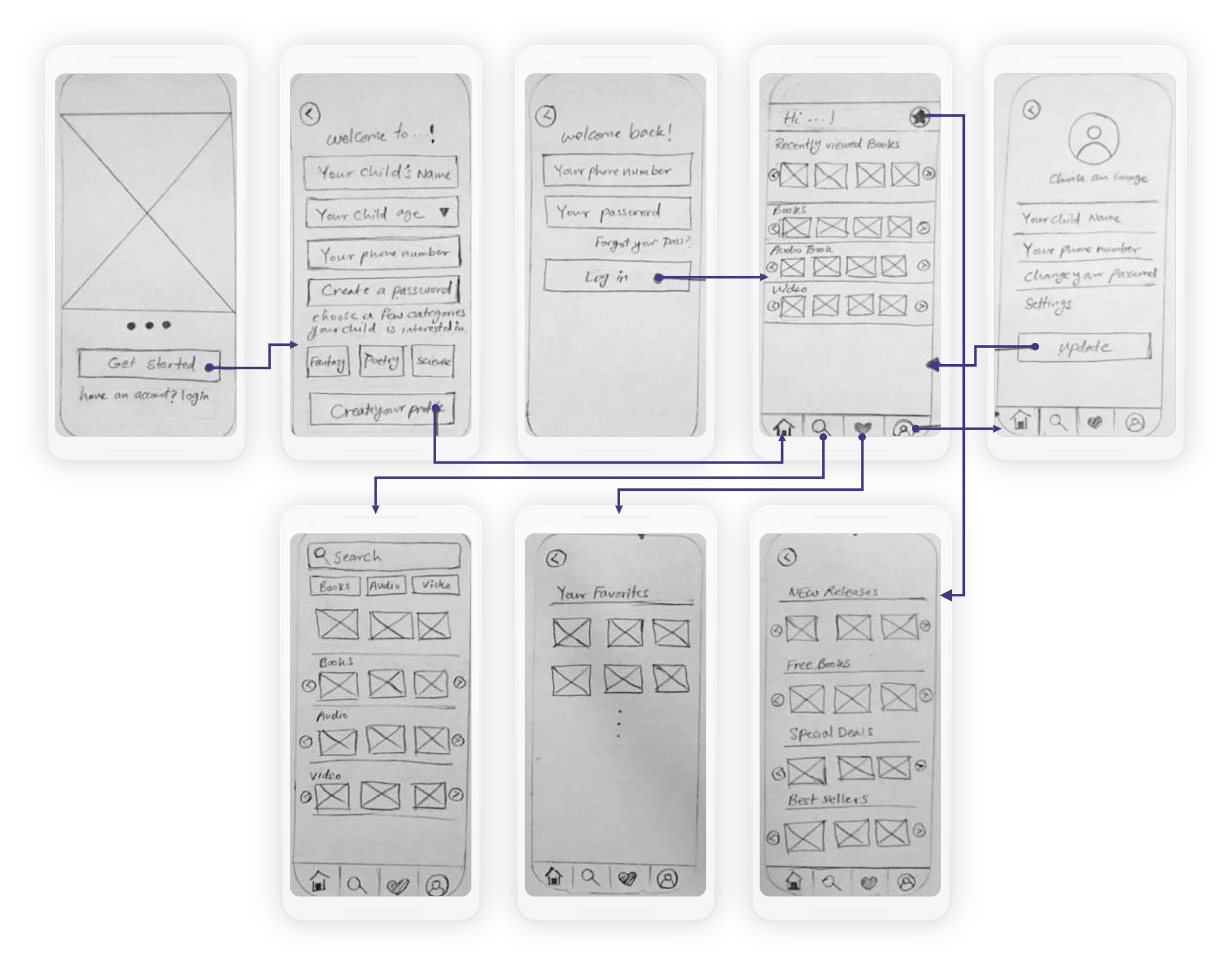
Onboarding
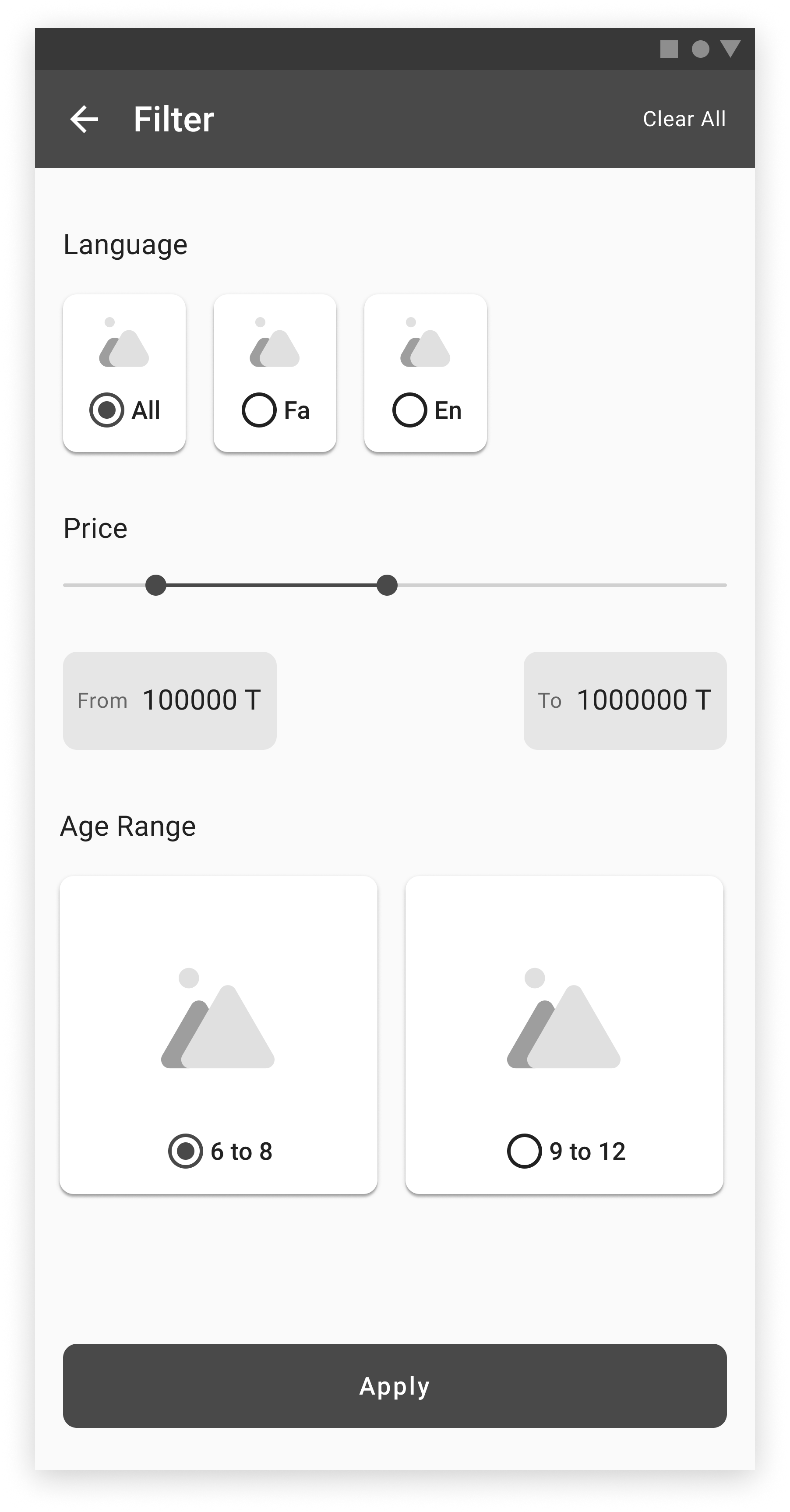
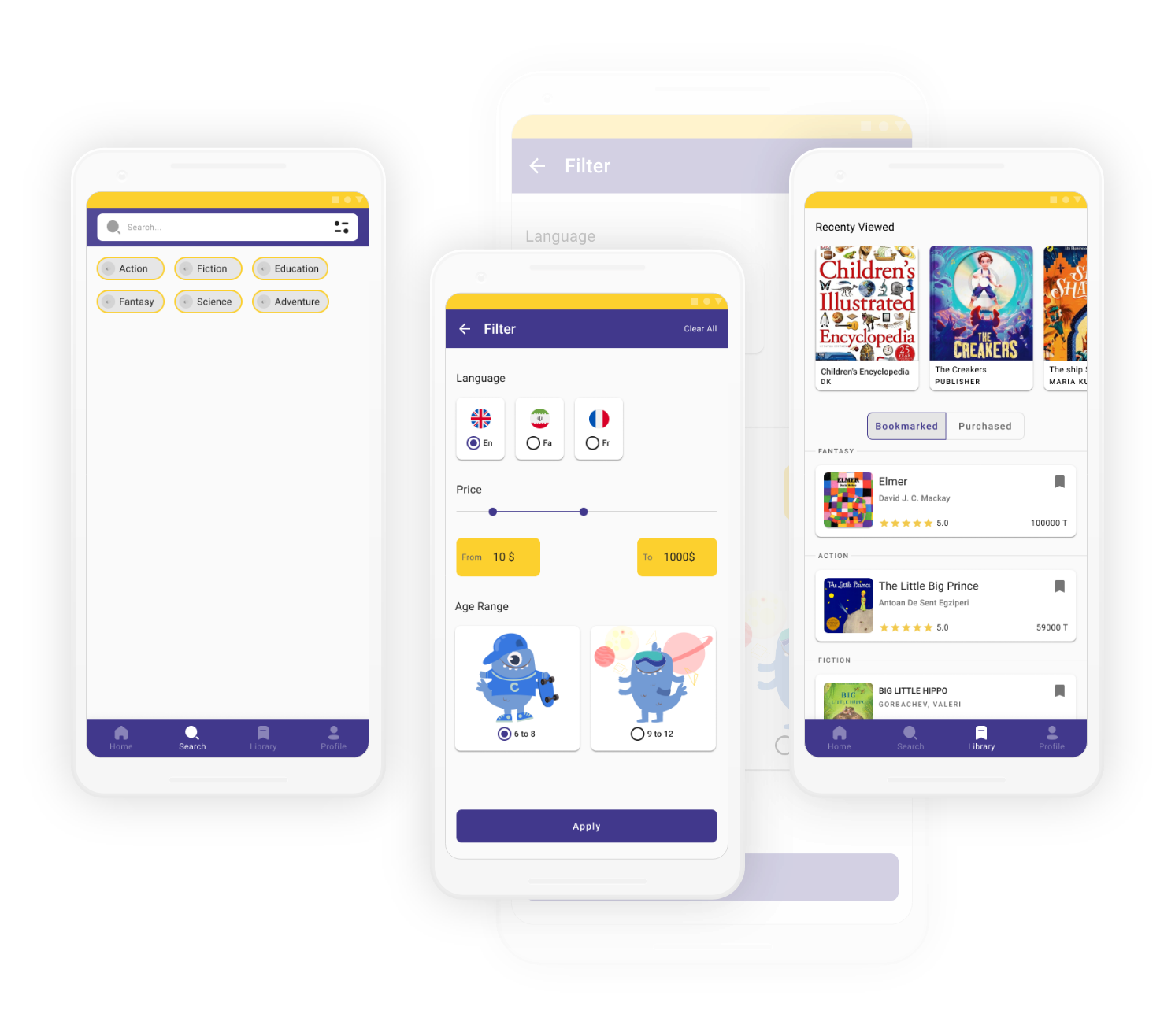
Filter
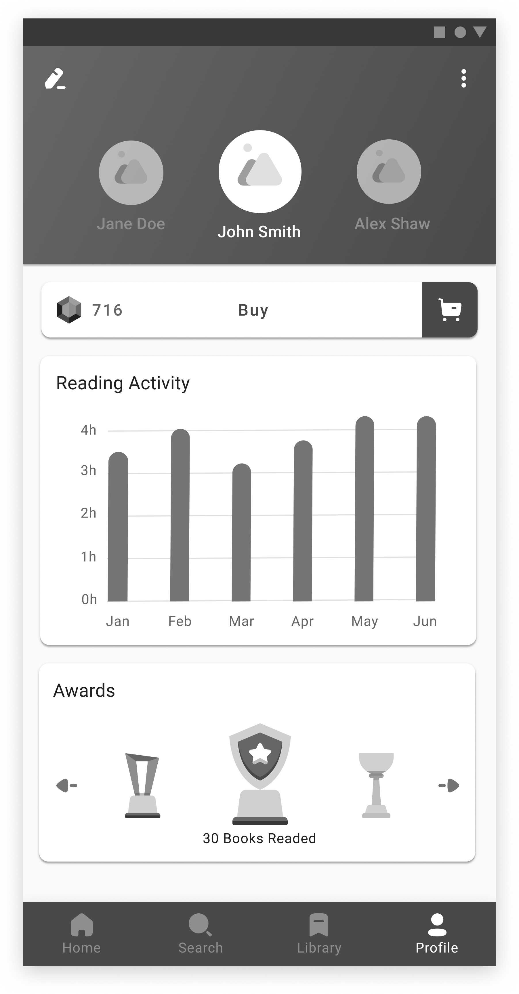
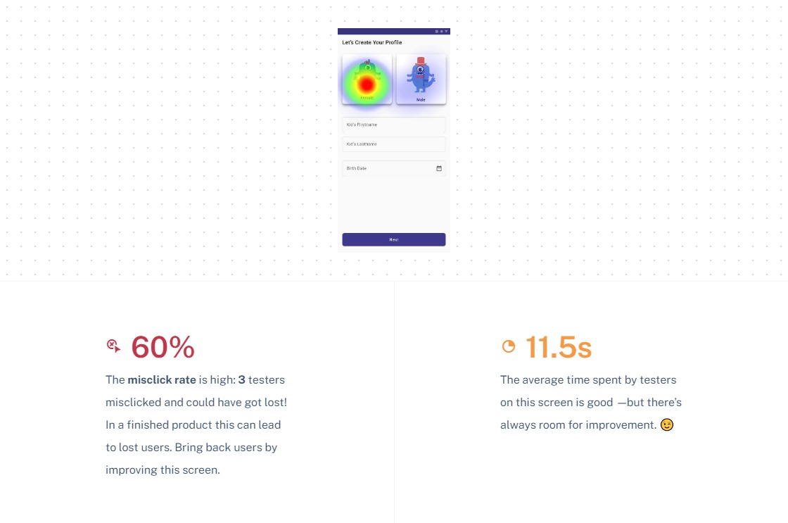
Profile
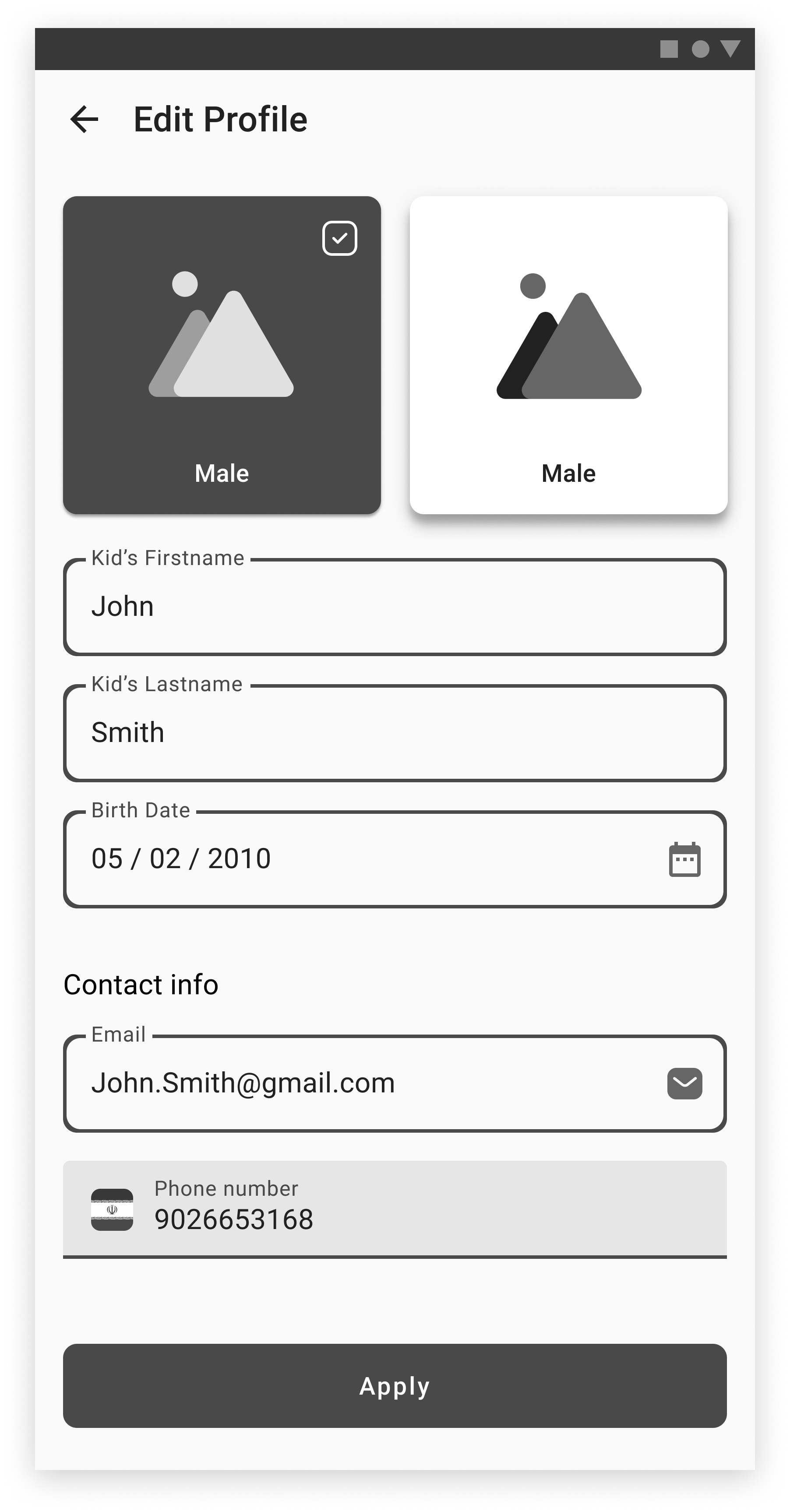
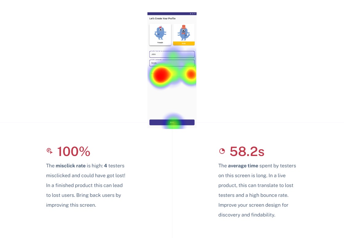
Edit Profile
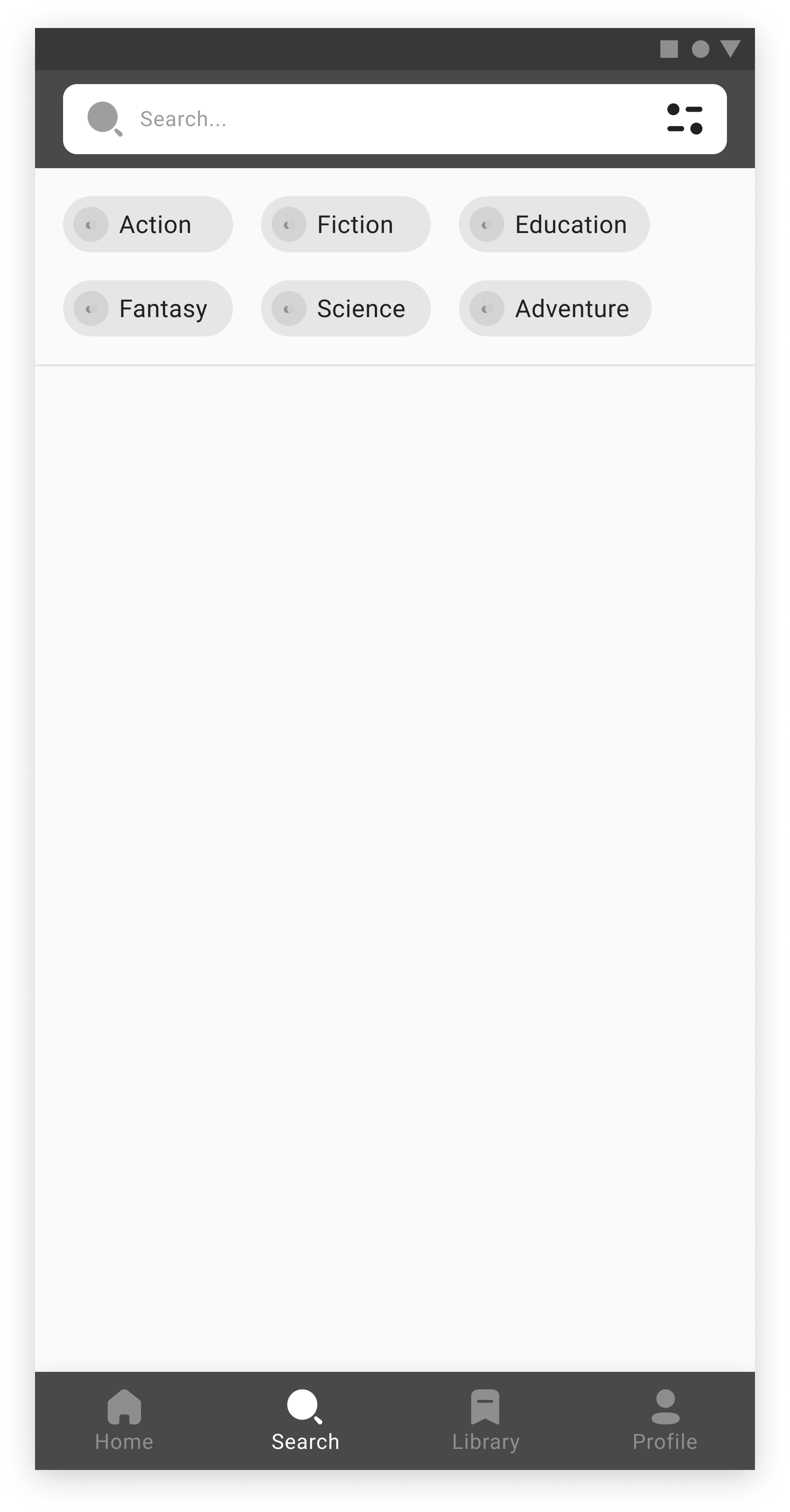
Search
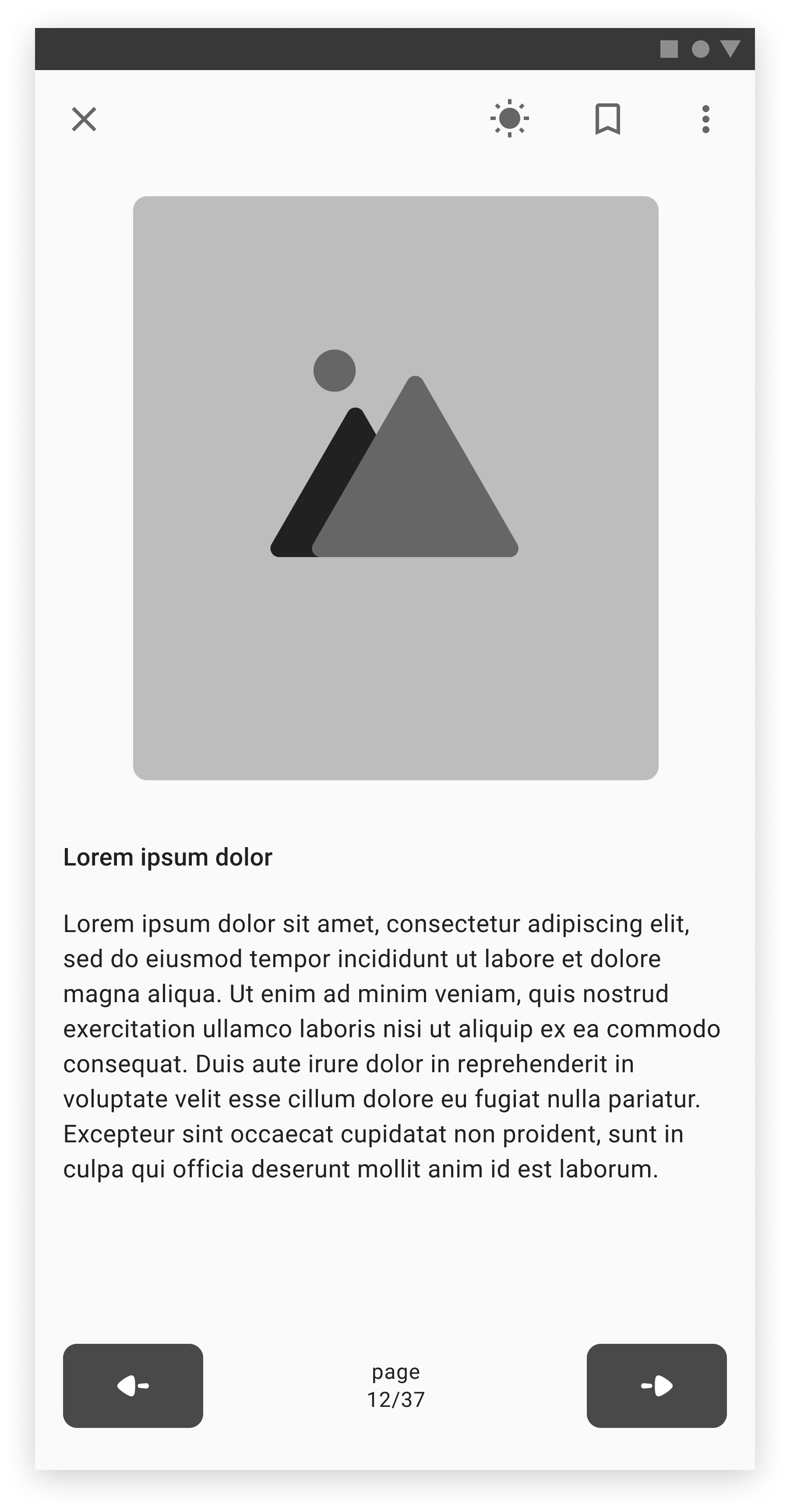
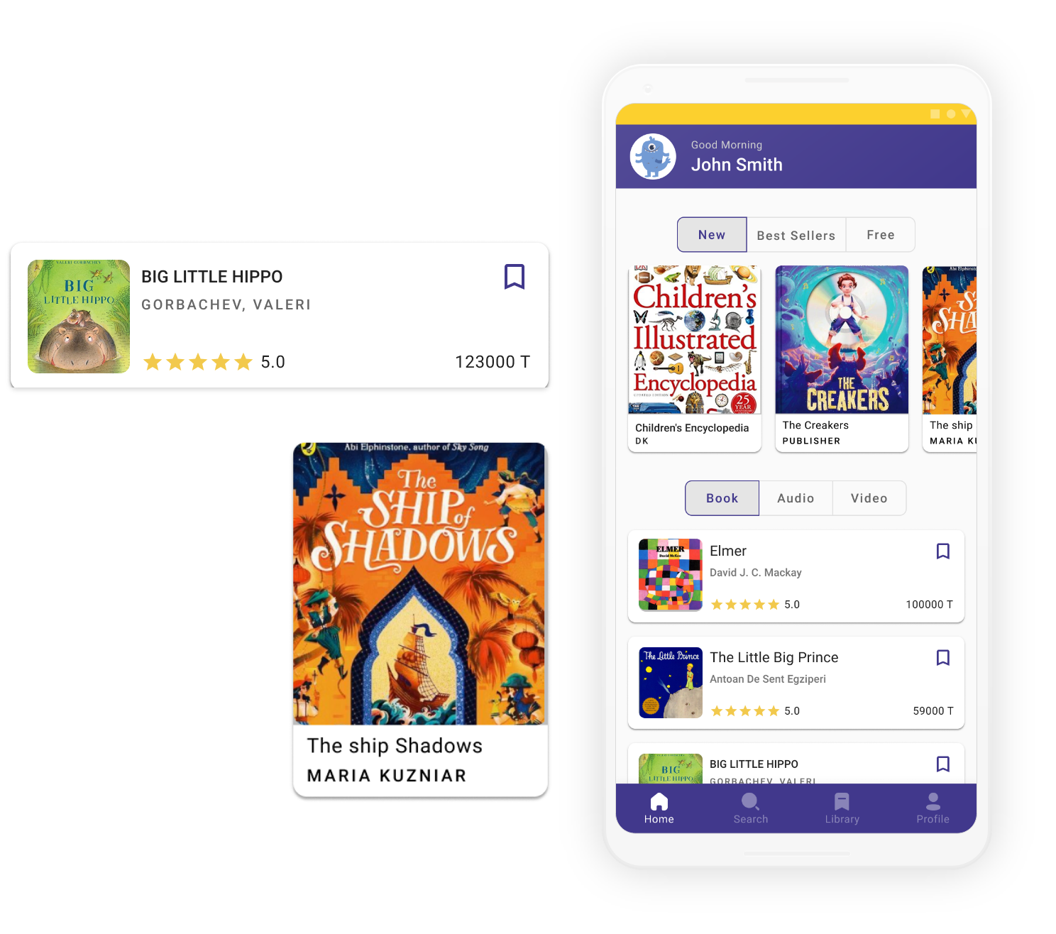
Book Viewer
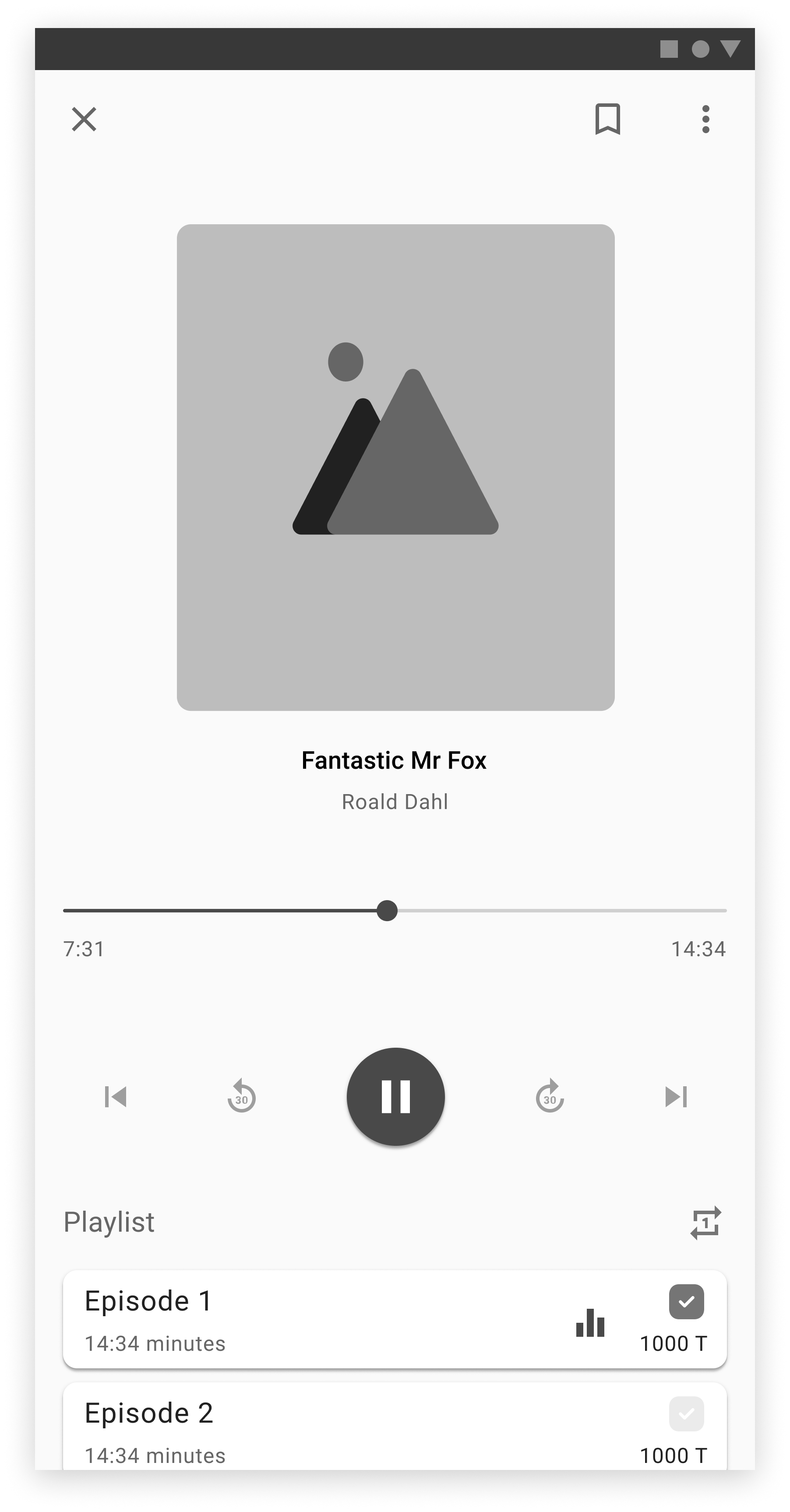
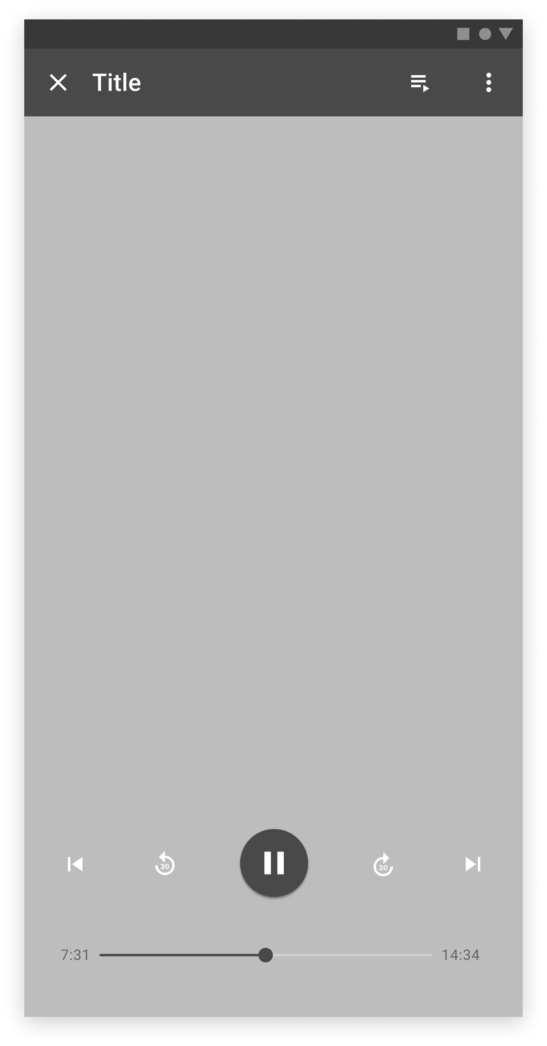
Audio Player
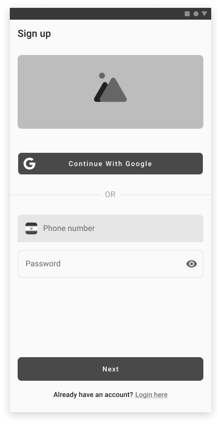
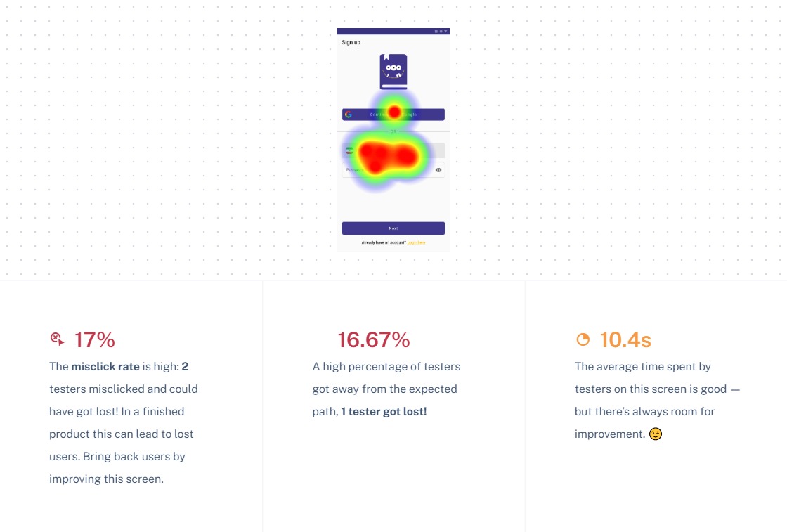
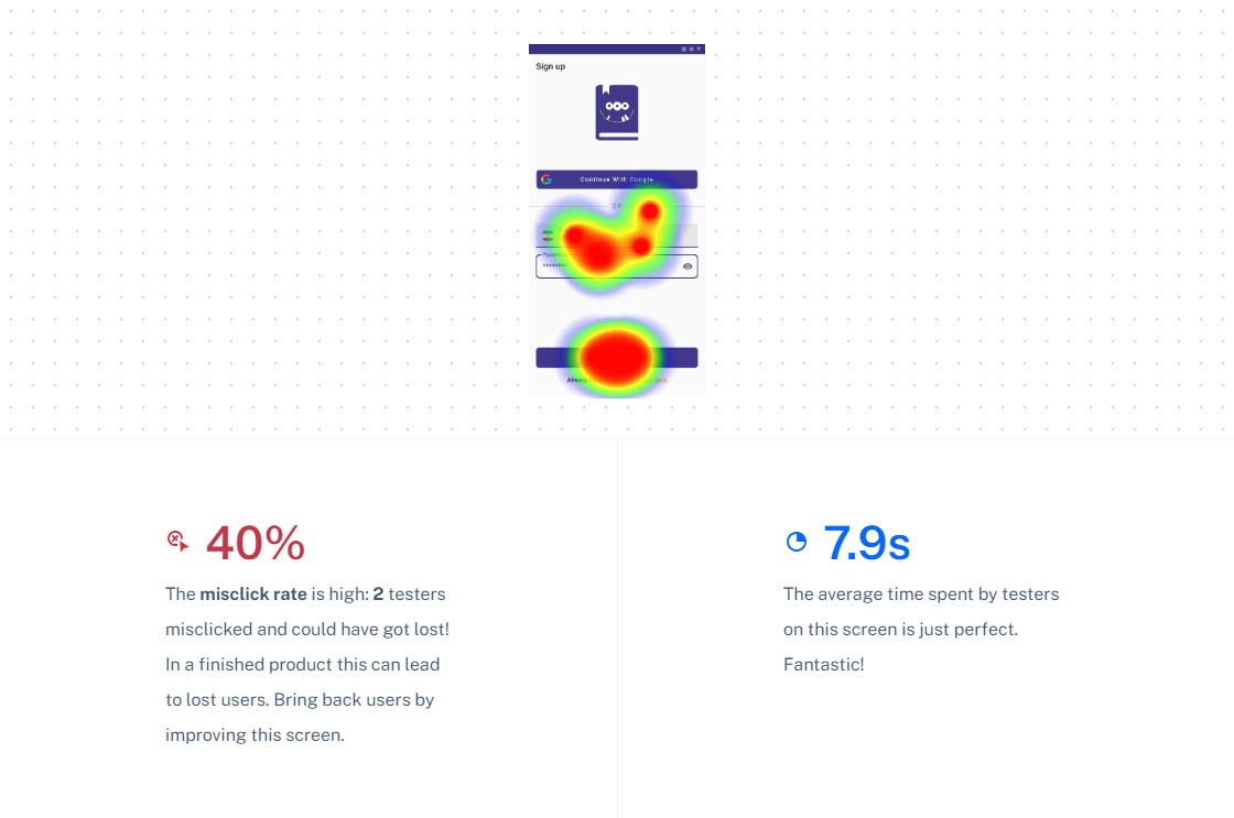
Sign up
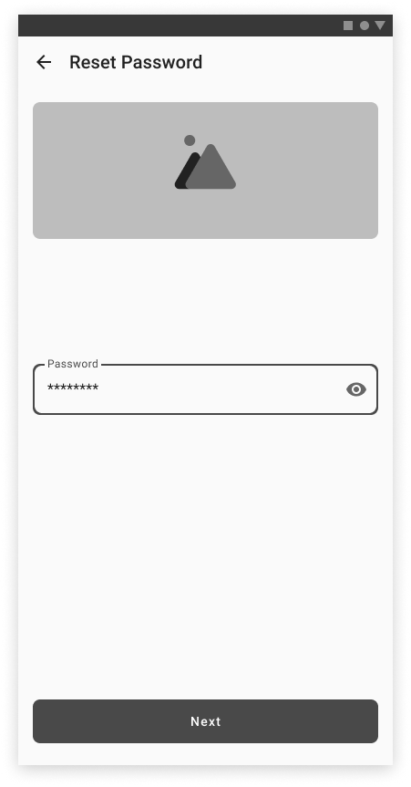
Password
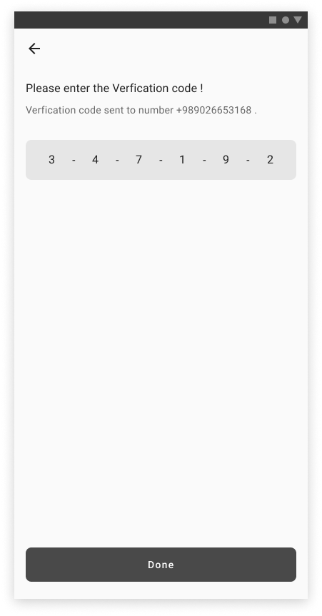
Verification
Welcome page
Information
Dashboard