
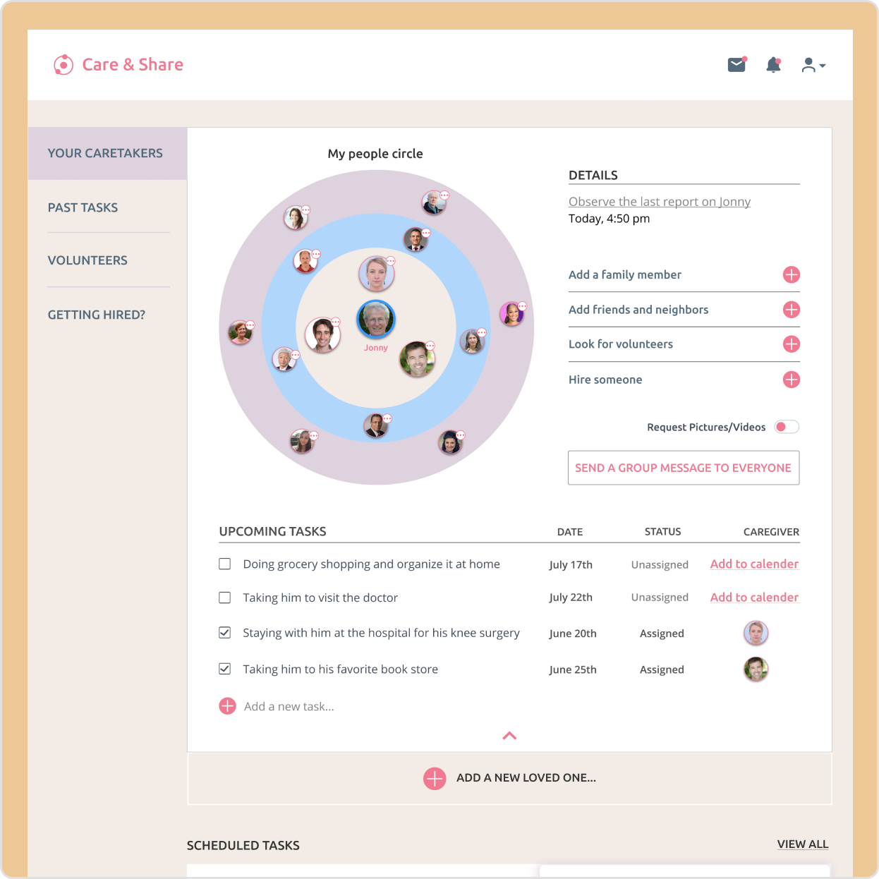
UX/UI Designer 2020 – Care & Share is a project that aims to improve the concept of family care by overcoming the limitations of existing platforms. With many people living at a distance from their loved ones, the platform recognizes the challenge of providing regular care and support. Care & Share goes beyond traditional senior healthcare, focusing on enhancing the overall quality of life for both users and their loved ones. As part of the design and development team, I helped create an identity that reflects the platform’s core values. Care & Share connects individuals with professional caregivers, support networks, and specialized services to bridge gaps caused by distance. Through continuous improvement and collaboration, Care & Share strives to create a more inclusive and supportive environment for families.
Task
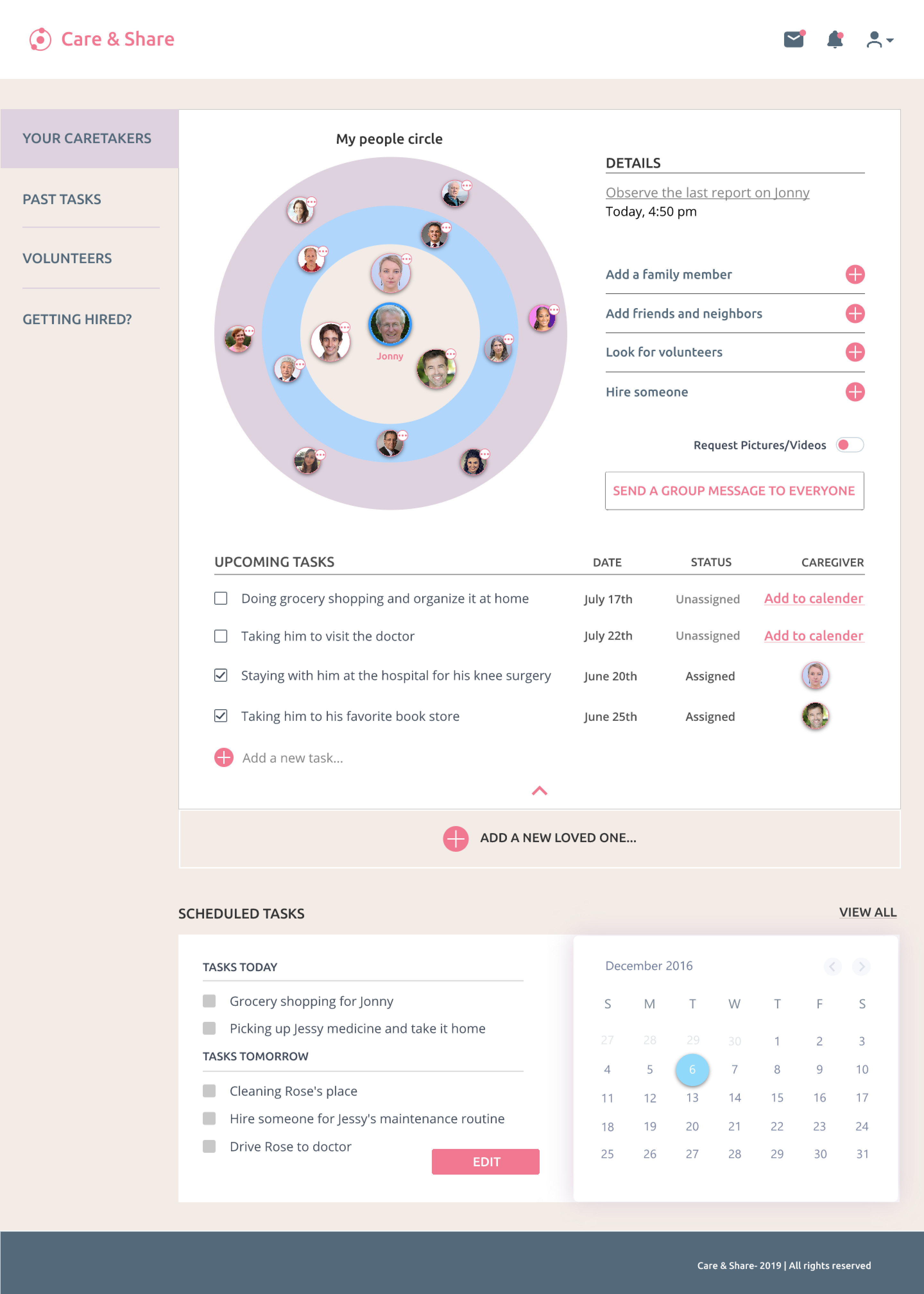
Care & Share was a solo design project that aimed to enhance family care by addressing the limitations of existing platforms. The challenges included providing remote care and support, improving overall quality of life, creating an inclusive platform, designing a minimal dashboard, ensuring privacy and data security, gathering user feedback, managing time constraints, and prioritizing user needs. Despite these challenges, the project sought to bridge the gap caused by distance and create a supportive environment for families.


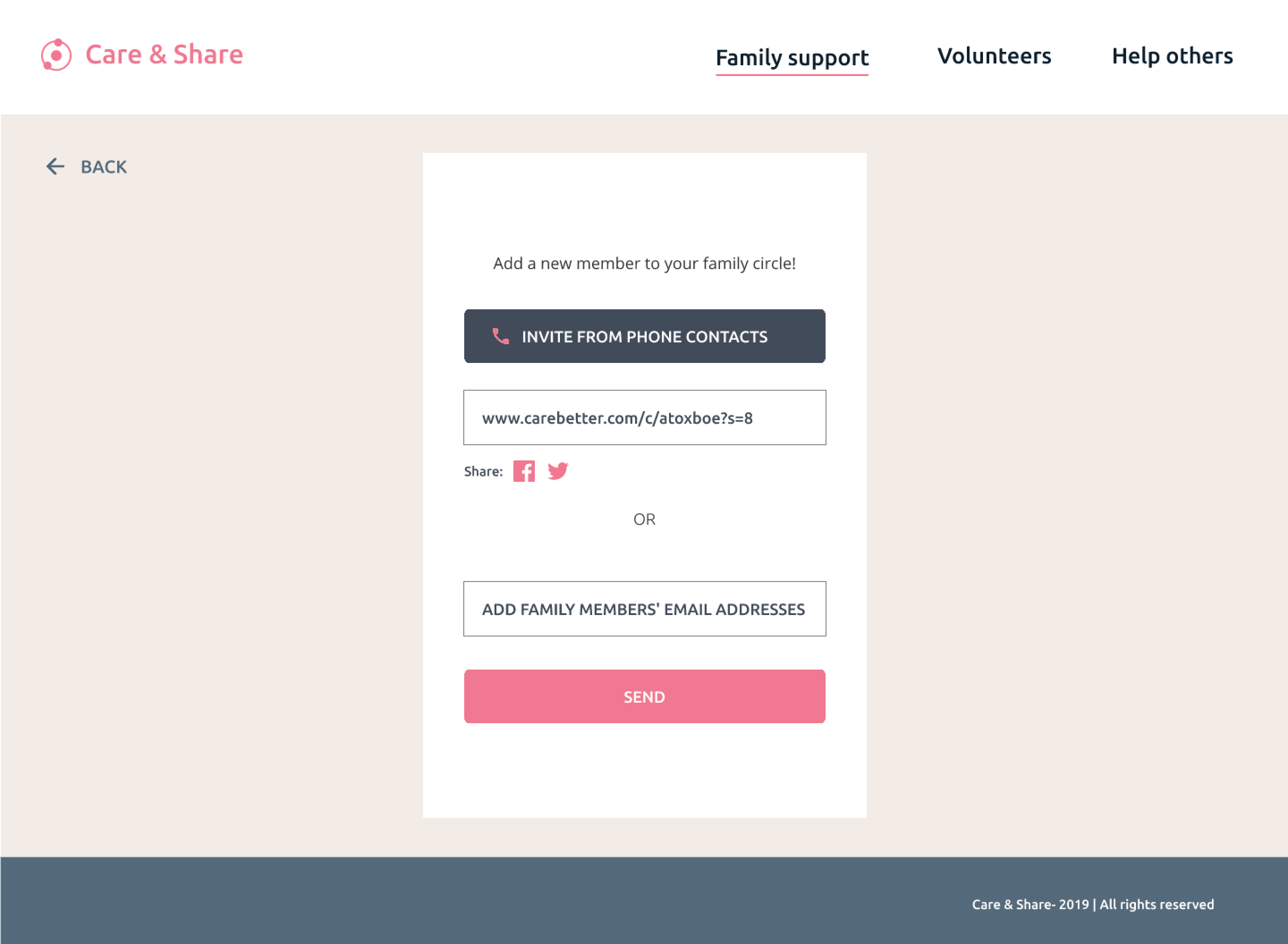
Add-a-new-family-member
Caretaker-form-careshare
Dashboard
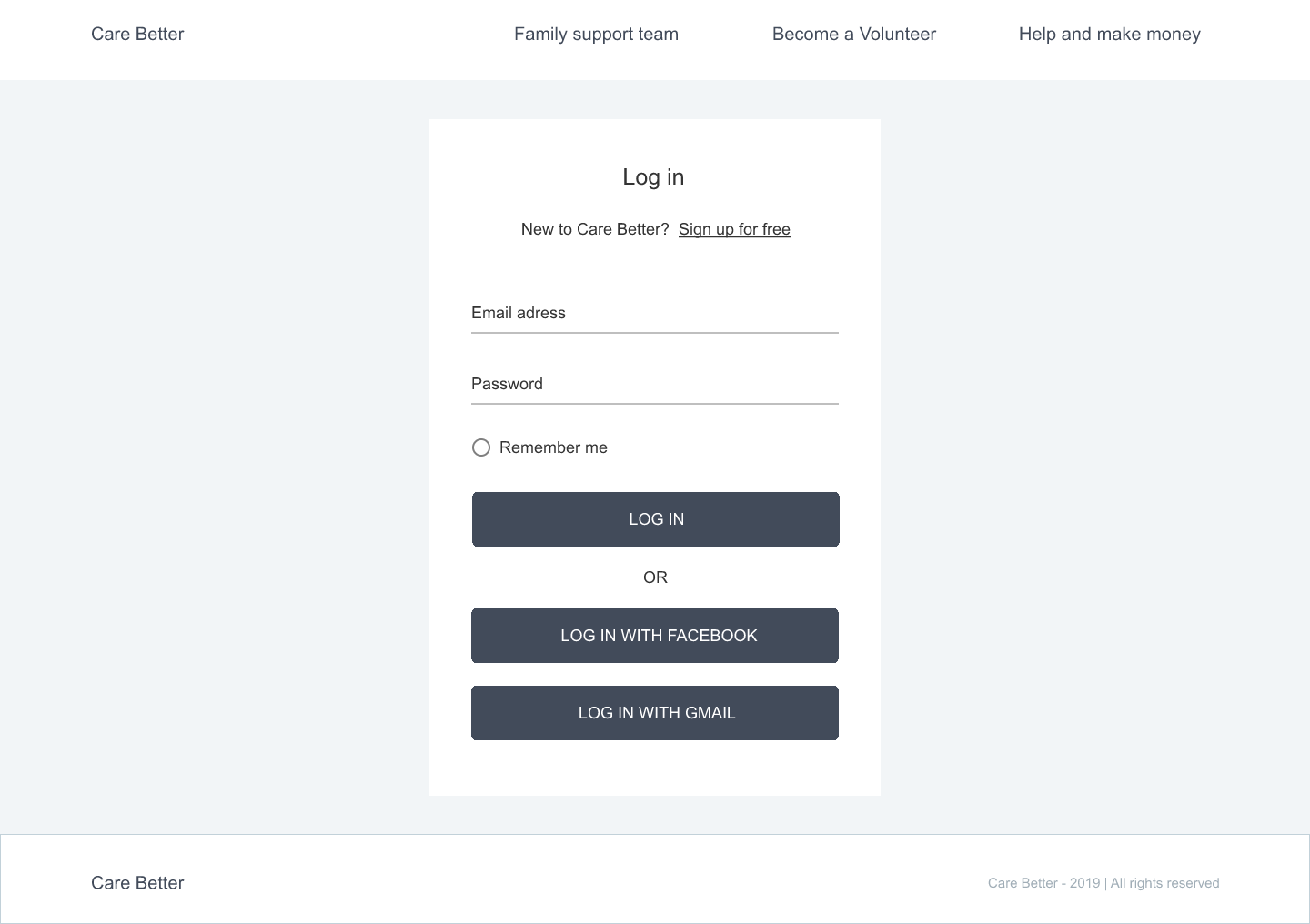
Log-in-careshare
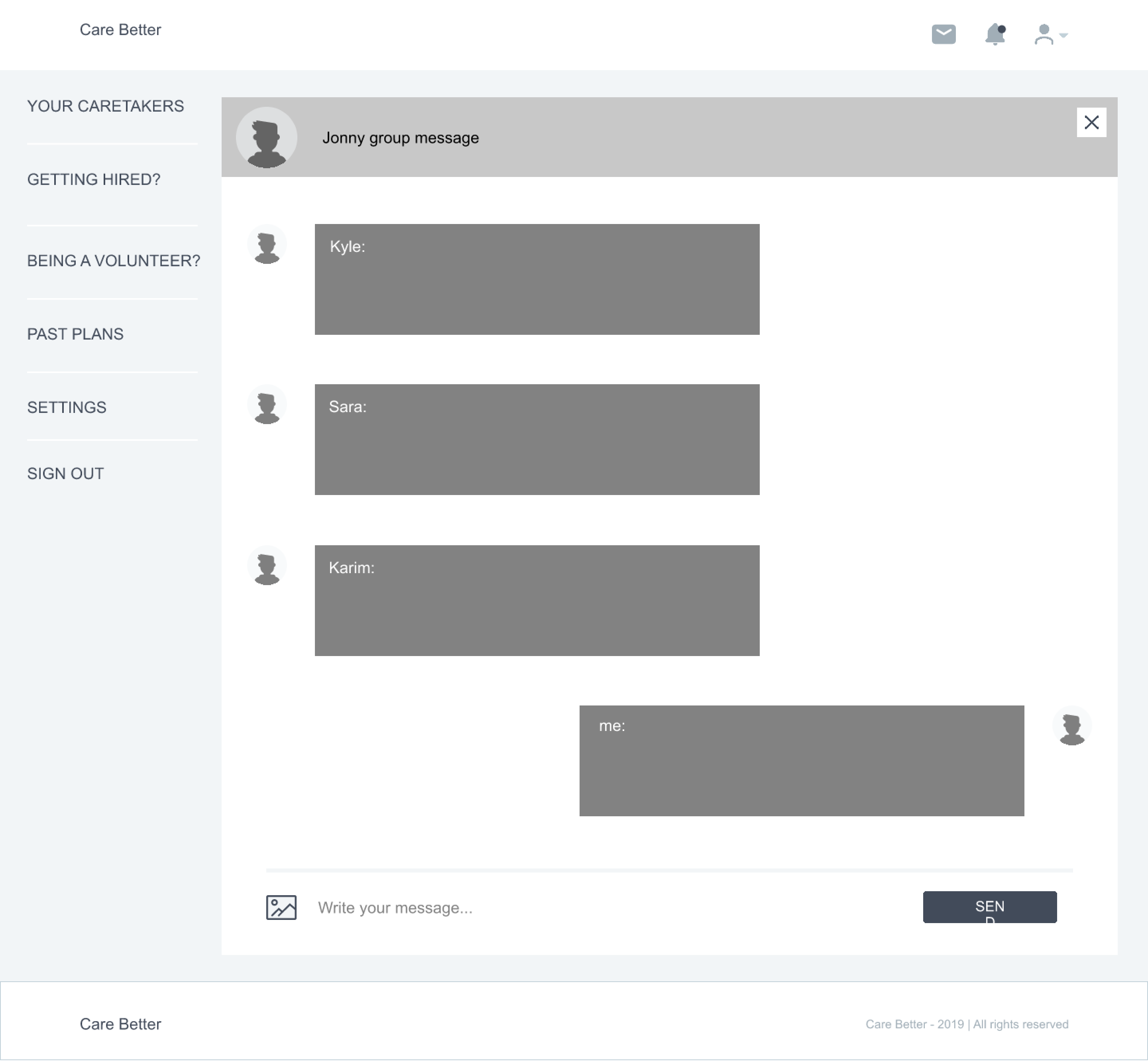
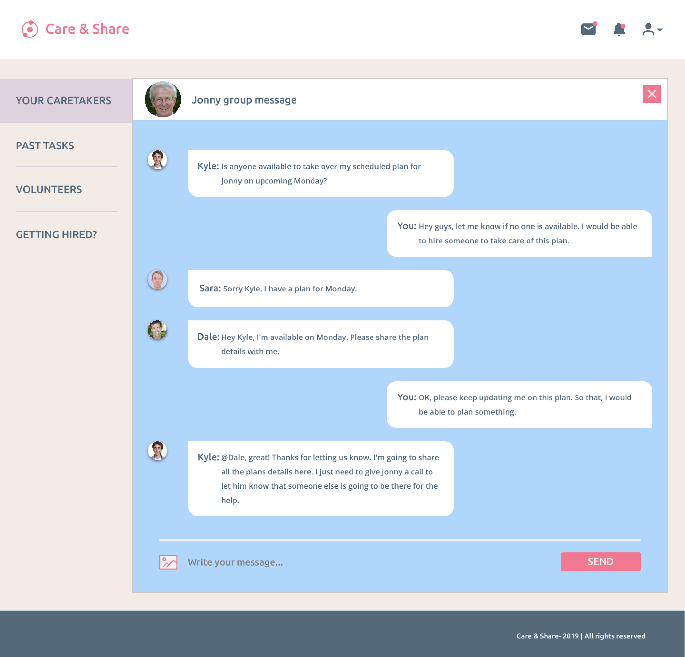
Send-a-group-message-careshare
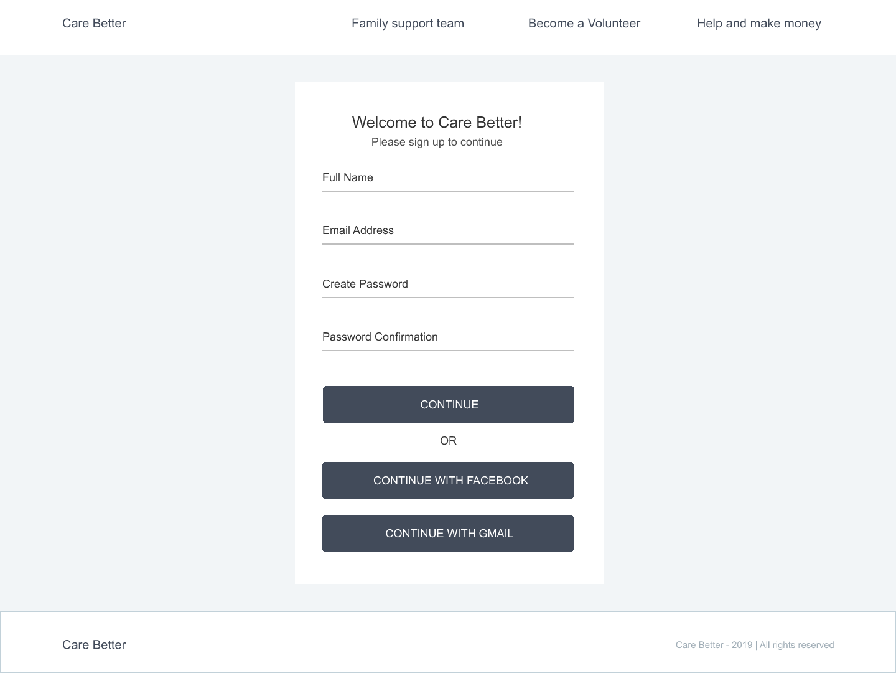
sign-up-careshare

Add-a-new-family-member
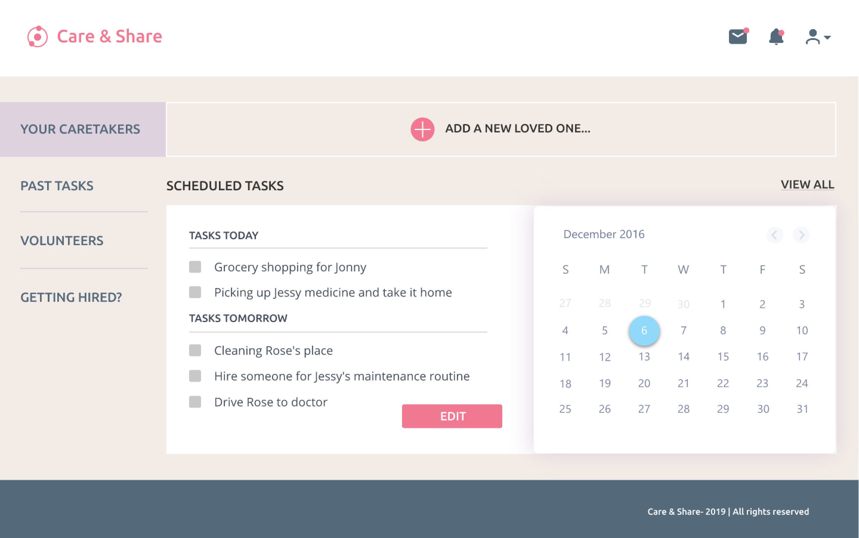
Dashboard
Dashboard-Empty-state-explore
Hire-someone
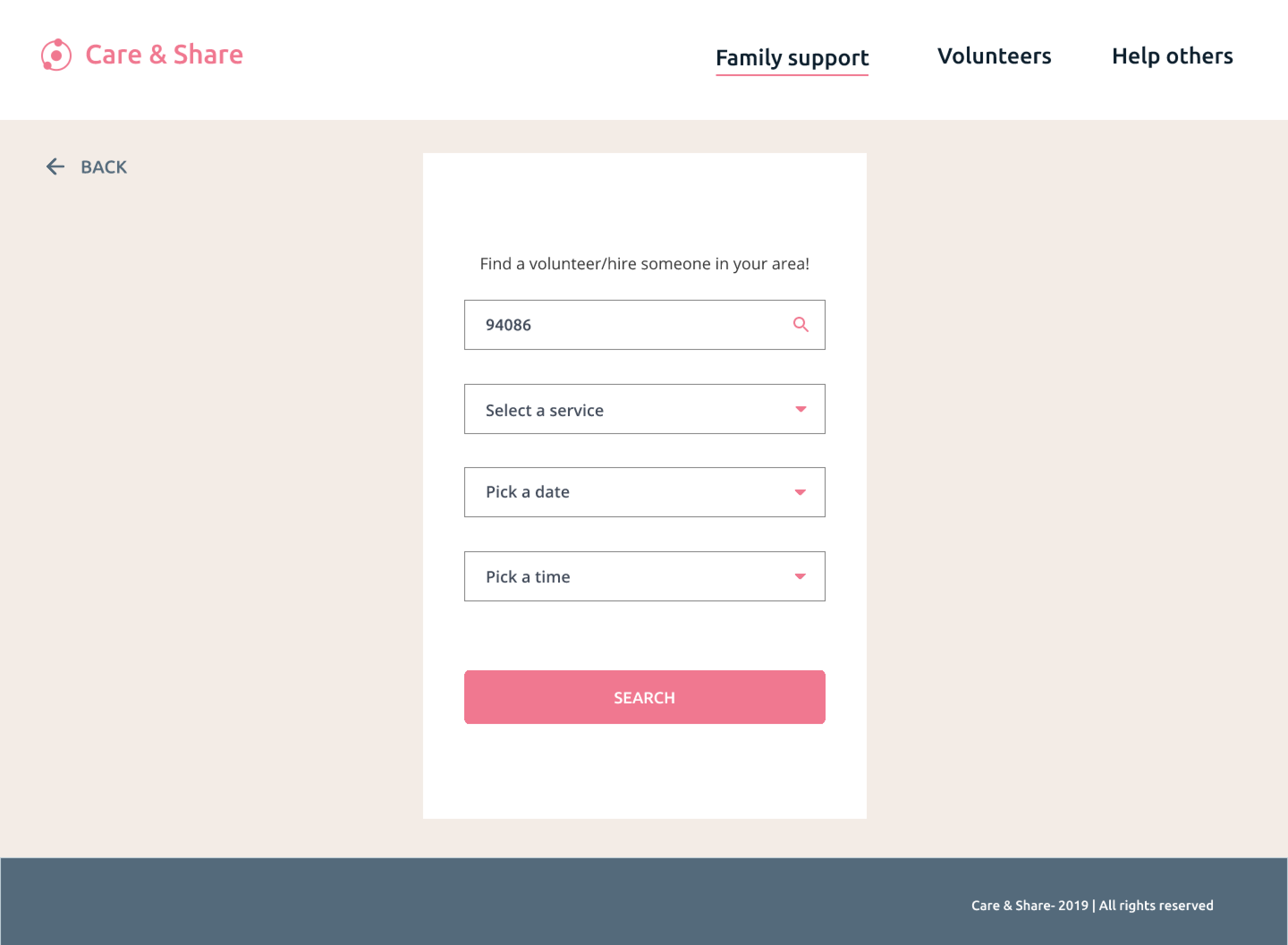
look-for-new-volunteer_hire-someone-in-the-area
Send-a-group-message
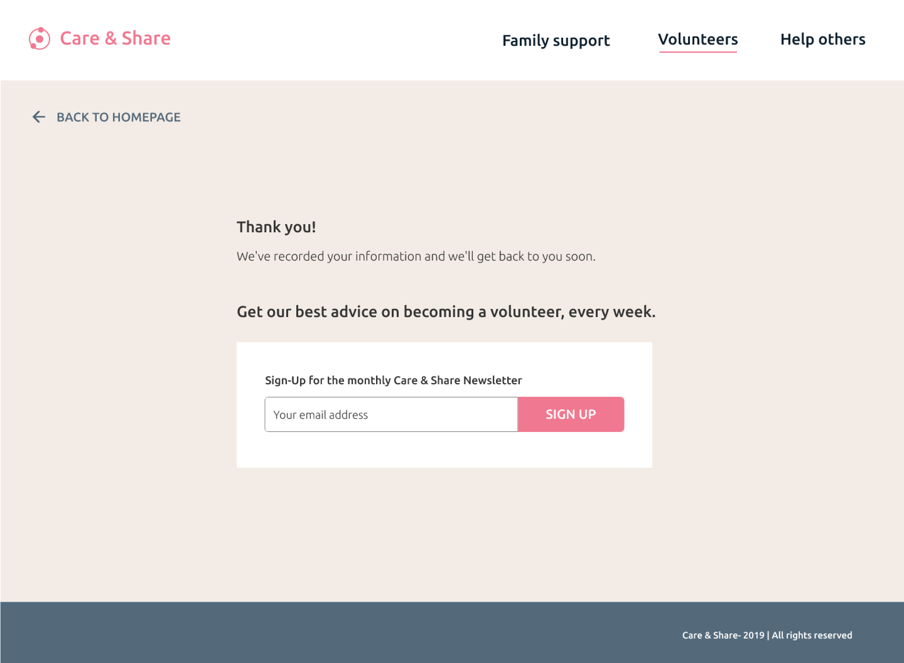
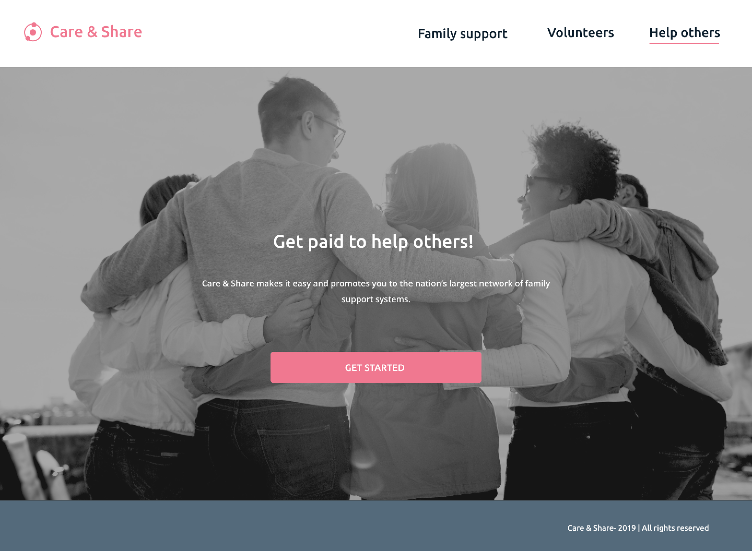
Thank-you-page-for-volunteers
