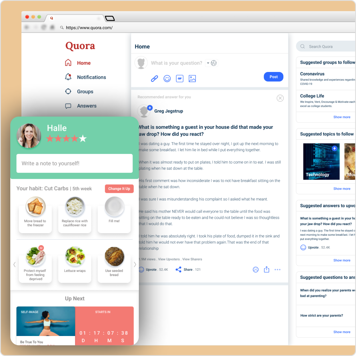
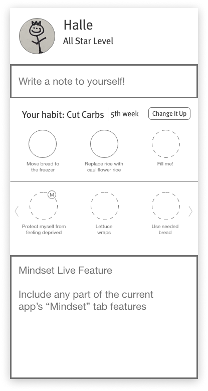
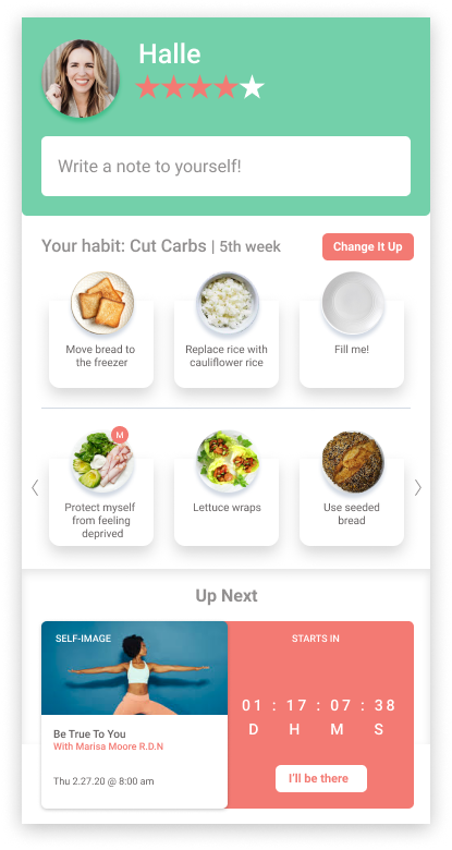
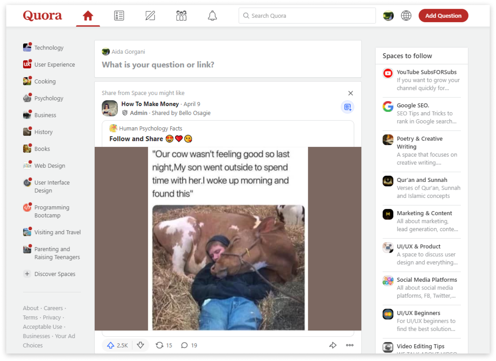
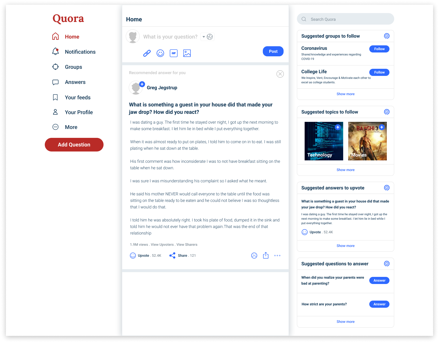
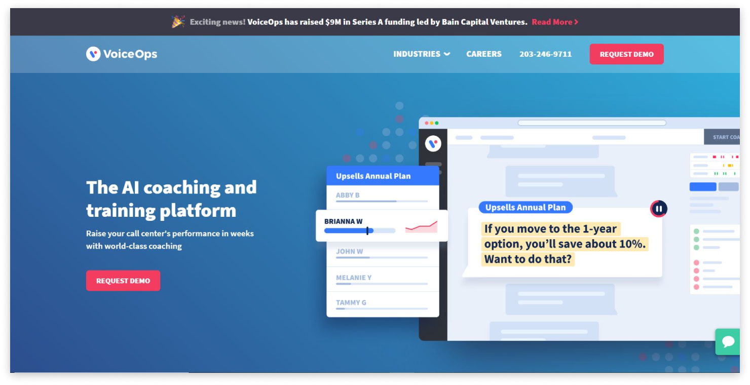
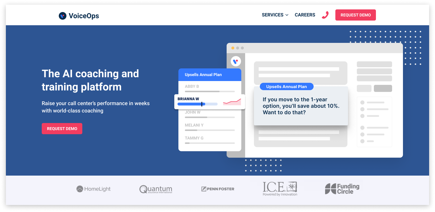
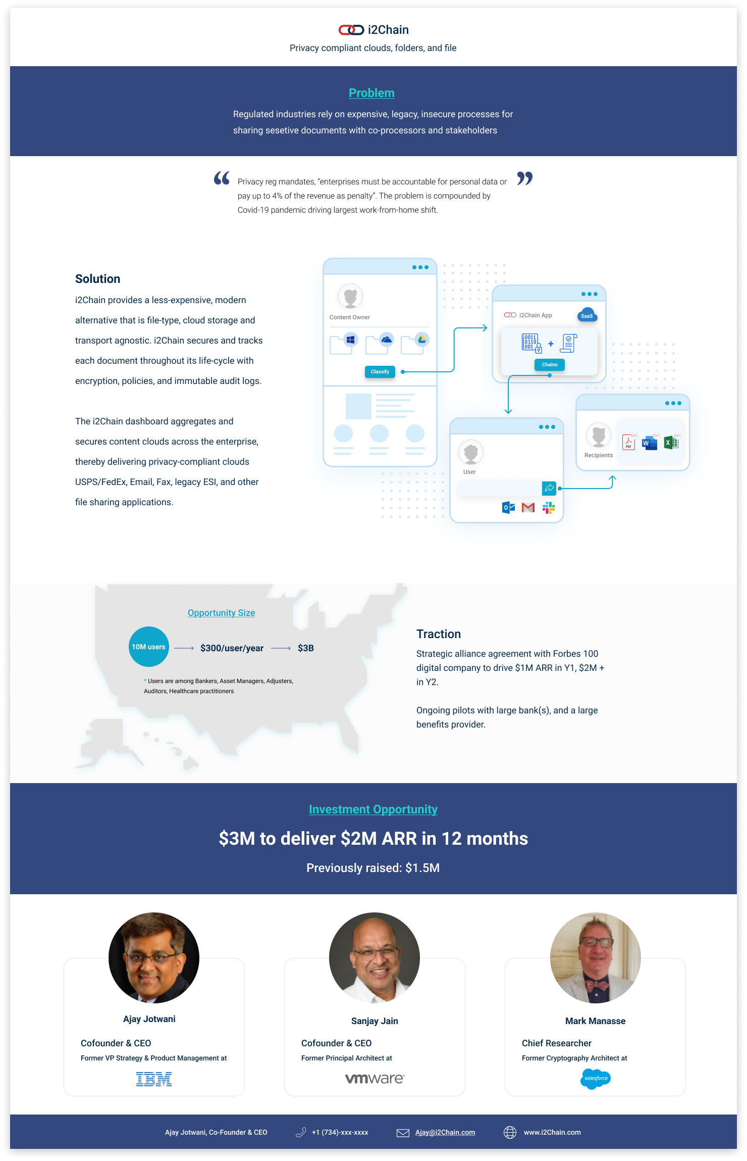
Visual Designer – During my free time, I embarked on a series of design exercises and client requests, which involved selecting random websites and apps from the internet and redesigning their single screens. This comprehensive list of interview exercises and client requests provided me with an opportunity to hone my design skills and expand my creative abilities. By immersing myself in these diverse projects, I was able to explore various design styles, enhance usability, and effectively convey information through visual elements. This experience not only allowed me to refine my problem-solving abilities but also provided valuable hands-on practice in independent design work. Overall, it was a rewarding journey that helped me further develop and apply my skills in practical design scenarios

Visual Design 1

This visual design exercise involved receiving a sketch and being tasked with creating a visually appealing design for a single-screen app.

Initial Idea
Visual design

Visual Design 2

During my redesign process, I dedicated around 4-5 hours to conducting research and implementing visual design changes. Several key elements were modified to enhance the overall user experience:

  1. Iconography, layout, and website structure were updated to align with modern design trends. Through competitive analysis of popular platforms like Twitter and Facebook, I ensured a more contemporary look and feel.

  2. The top navigation was replaced with a modern navigation bar on the left, streamlining access to information and improving organization.

  3. A more efficient and user-friendly approach was implemented for adding new questions or links, reducing the number of steps and clicks required.

  4. The “Spaces” title in the top navigation was changed to “Group” to enhance clarity and usability, pending further validation through usability testing.

  5. Call-to-action buttons for recommended answers on the feed were redesigned to align with familiar and minimalistic styles, ensuring user familiarity and modernity.

  6. The entire right section underwent a redesign to adopt a more contemporary visual style.

Overall, the homepage received a comprehensive and modern revamp, with each change grounded in thorough research and a strong rationale.

Initial design
Redesigned dashboard

Visual Design 3

Here are the rationales behind each change made:

  1. The navigation bar, despite containing important information, was not visually prominent enough on the homepage. To address this, a bright color was chosen for the background of the navigation bar, ensuring that users would easily notice and prioritize the content.

  2. The decision to replace the linked phone number icon with a phone icon was based on improving user recognition and familiarity.

  3. To enhance clarity, the term “industries” was changed to “services” as it seemed to make more sense. However, further usability testing is necessary to validate this change.

  4. The hero section appeared cluttered with multiple colors and an outdated style, making it difficult to grasp the main purpose of the product. To address this, a single color was chosen for the background, and all elements were redesigned in an attractive, modern, and minimalistic manner.

  5. Recognizing the importance of highlighting the “Upsell Annual Plan” in the hero section, the other elements were intentionally subdued to draw the user’s attention to this key offering.

Initial hero section design
Hero section re-design

Visual Design 4 - i2Chain 1-pager re-design

Existing 1-pager
Redesigned 1-pager
Back